Amazon Sales Dashboard
Unlock Hidden Insights: Transforming Amazon Data into Actionable Intelligence
Category :
E-commerce
Powered by :
YBAISolution
Tool Used :
Power BI
Designer :
Bhrami Zadafiya
Amazon Sales Dashboard
Amazon Product Overview
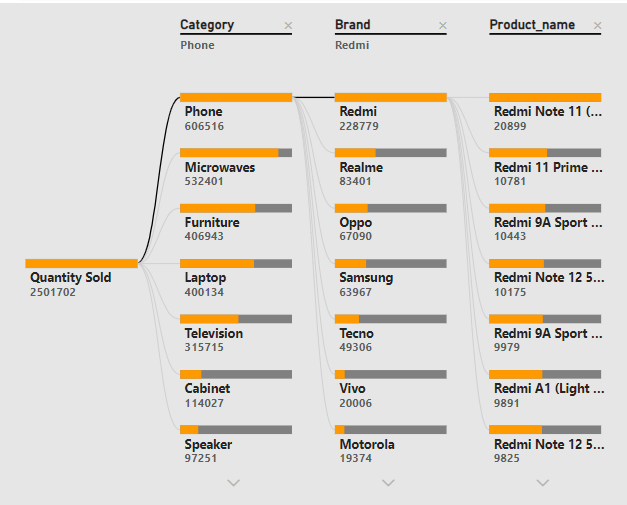
This visual is a Decomposition Tree — it breaks down a measure (in this case, Quantity Sold) step by step into hierarchical categories like Category, Brand, and Product_name. The root node is Quantity Sold (total: 2,743,002). It’s broken down first by Category (e.g., Phone, Microwaves...). Then into Brand under each category (e.g., Redmi, Samsung...). Then into Product_name under each brand (e.g., Redmi Note 11).
Amazon Sales Dashboard
Sales trend with forecast
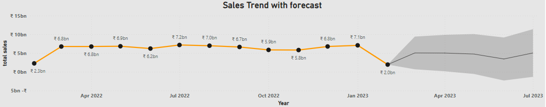
The Sales Forecast Line Chart presents both historical sales performance and future projections. Spanning from February 2022 to the forecasted months of 2023, the x-axis represents time, while the y-axis shows total sales in ₹ (Rupees) Billion. The orange line tracks actual sales progression, while black dots mark actual data points, and a shaded gray area illustrates the predicted range for upcoming sales. This visualization is vital for strategic planning, budgeting, and identifying risks in the business’s sales lifecycle.
Amazon Sales Dashboard
Profit and Discount cost per Category
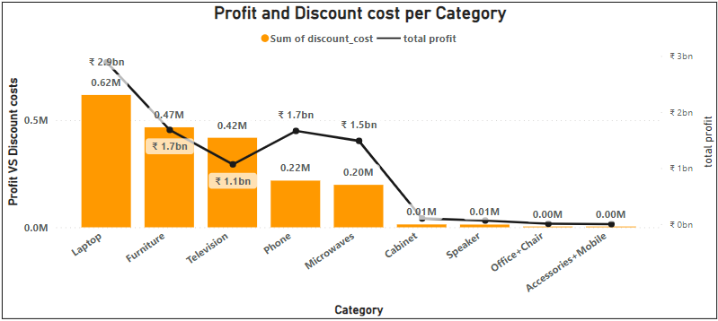
This is a combination chart that integrates both a bar graph (orange) and a line graph (black) to illustrate the relationship between discount spending and profit generation across various product categories. The x-axis displays different product categories, while the left y-axis corresponds to the discount cost in million ₹, and the right y-axis shows the profit in billion ₹. This visual comparison helps in understanding which categories are yielding high profits with minimal discount expenses and which ones may be over-discounted yet underperforming in profit. By identifying high-margin, high-return products, this chart enables profitability optimization and smarter decision-making for future marketing and discount strategies.
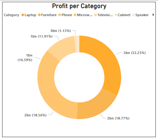
Amazon Sales Dashboard
Profit Per Category
This donut chart showing profit per product category with the total as 100%. Each slice is color coded and labeled with Profit amount (in billions) and Percentage of total profit Laptop leads with 3bn profit (32.42%) – contributes nearly 1/3 of all profits. Furniture, Phone, and Microwave categories each bring in ~2bn, together making up 53.75% of profit. • Furniture: 18.73% • Phone: 18.54% • Microwave: 16.48%
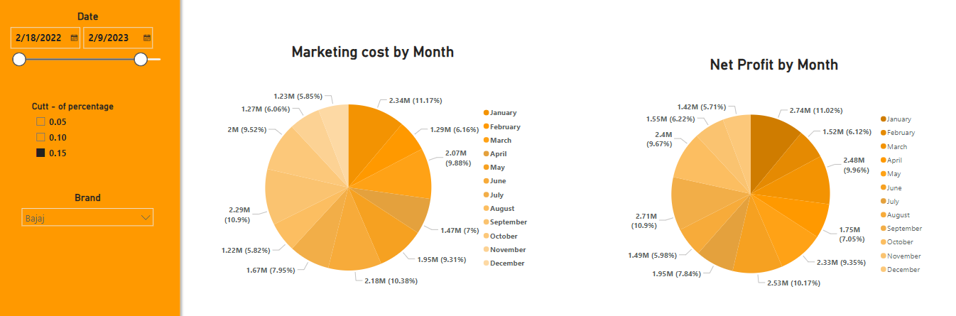
Amazon Sales Dashboard
Marketing Costs vs. Net Profit
This is a pie chart showing the net profit and marketing cost distribution across all 12 months of the year. It gives a snapshot of how profit fluctuates seasonally, which helps in identifying high-performance periods and potential weak spots. This insight helps to find if we reduce the marketing cost for one particular month, then it will reflect on net profit chart it will increase the profit for that particular month. This pie chart illustrates the distribution of net profit and marketing costs across all 12 months of the year, offering a clear snapshot of seasonal profit fluctuations. It helps identify peak performance periods as well as potential underperforming months. The chart also suggests that reducing marketing expenses in specific months could lead to a direct increase in net profit, making it a valuable tool for optimizing monthly marketing budgets and maximizing profitability.
Amazon Sales Dashboard
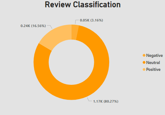
Review Classification
This is a Pie Chart for review sentiment analysis we can see that almost 1200 products got neutral reviews Around 200 got positive review while only few products got negative review The color gradient shows the count of product darker the gradient, the higher product count.