Ajay's Dashboard
Ajay's Fast Food Dashboard, created in Power BI, is a comprehensive analytics platform catering to the fast food industry. It comprises multiple reports covering crucial aspects such as sales analysis, purchase analysis, customer demographics, geographic trends, feedback analysis, marketing effectiveness, and transportation insights. Through interactive visualizations and detailed reports, it empowers fast food businesses to optimize operations, enhance customer experiences, and drive strategic growth initiatives for improved performance and profitability.
Category :
Hospitality
Powered by :
YbAISolution
Tool Used :
Power BI
Designer :
Bhrami Zadafiya
Ajay's Dashboard
Employee Performance
This insight evaluates the efficiency of employees in handling customer orders, satisfaction levels, and revenue contribution.
Ajay's Dashboard
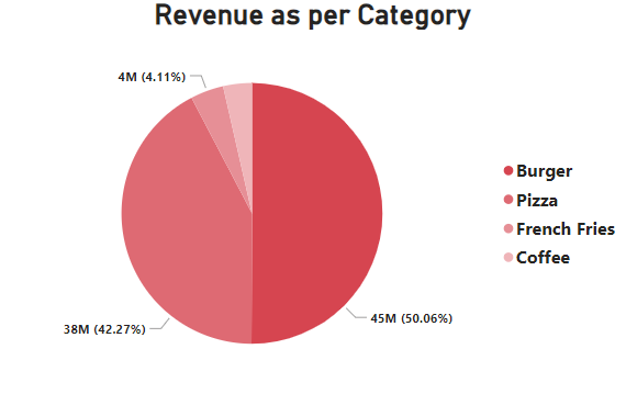
Revenue by Category
This graph, likely a pie chart, showcases revenue distribution across various product categories. It visually highlights which categories generate the highest revenue and which contribute the least.
Ajay's Dashboard
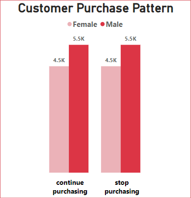
Customer Purchase Pattern
This graph shows purchase frequency across different customer segments, highlighting peak purchasing times by gender demographics. Understanding purchase patterns can help optimize promotions and improve stock availability.
Ajay's Dashboard
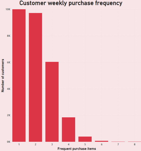
Customer Weekly Purchase Frequency
This is a bar graph that represents how frequently customers make purchases within a week. The x-axis displays the frequency of purchases (e.g., 1 purchase, 2 purchases, etc.), while the y-axis represents the number of customers. The graph helps identify whether most customers are occasional buyers or regular customers who make multiple purchases per week. The insight helps in identifying customer engagement levels. If frequent purchases are low, introducing loyalty programs or targeted promotions could encourage repeat purchases and boost sales.
Ajay's Dashboard
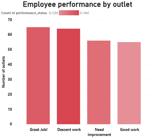
Employee Performance by Outlet
This bar graph visualizes employee performance ratings across different outlets. The x-axis represents performance categories such as Great Job, Good Work, Decent Work, and Needs Improvement, while the y-axis represents the number of outlets where employees fall under each performance category. This insight helps in understanding how employee performance is distributed across various outlets. The insight highlights outlets with strong employee performance and those requiring training or motivation. Focusing on training and performance incentives can improve overall efficiency.
Ajay's Dashboard
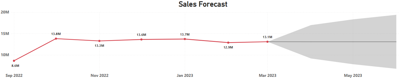
Sales Forecast
A line graph displaying sales performance over time, showing peaks and dips in revenue. A predictive line graph estimating future sales based on historical data. Forecasting helps in better inventory management and budget planning.
Ajay's Dashboard
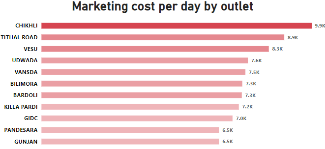
Marketing Cost per Day by Each Outlet
This bar graph represents the total marketing cost incurred per day across different outlets. It helps in understanding which outlets are investing more in marketing and which ones have lower expenditures. This insight helps in optimizing marketing budgets by identifying high-cost outlets and assessing if their spending results in higher sales. Adjustments can be made to maximize ROI on marketing investments.
Ajay's Dashboard
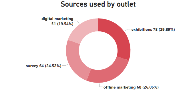
Sources Used by Outlet
This pie chart illustrates the different marketing sources utilized by each outlet. The chart is divided into segments representing Digital Marketing, Exhibitions, Offline Marketing, and Surveys. The size of each segment indicates the proportion of marketing efforts dedicated to that specific source. This visualization helps in understanding which marketing channels are prioritized by different outlets. This insight helps outlets refine their marketing strategies by focusing on the most cost-effective and high-impact marketing channels to increase customer reach and engagement.
Ajay's Dashboard
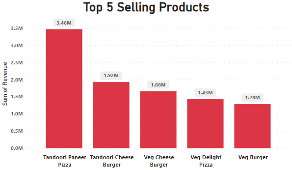
Top 5 Selling Products
This bar graph showcases the top 5 best-selling products based on total revenue generated. The x-axis represents the products, while the y-axis represents the sum of revenue. This insight highlights which menu items are driving the most sales and revenue. This insight reveals that pizza and burgers, particularly with tandoori and cheese variations, are the most in-demand products. Focusing on these items through marketing, bundle offers, and promotions can further boost sales.